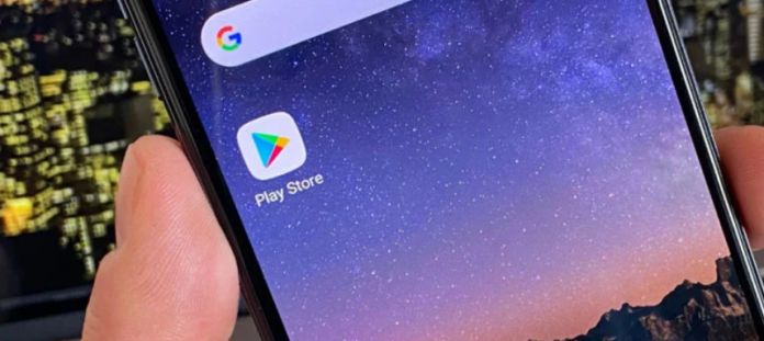
Google has started distributing a new look to all users within the Google Play Store, the official app and games store, as well as books and movies for Android. The novelty aims to hide the list of programs with available updates, making the experience in the place more confusing.
Remember the “My Apps” area that existed within the Side menu of the Google Play Store, where all available updates and recently updated apps appeared? So it will no longer be displayed to all Android users in no time. An update released by the search giant’s server side moved the location to a larger number of taps on the screen and divided the view into two different areas.
Previously available in the upper left corner, the area recently went inside the icon with the face of the profile connected, but it was still easy to reach. Now you’ll need to tap this same location, then “Manage apps and devices” and see if there’s any updates. Right away the list of apps that have received some update is no longer displayed and the user needs to tap a tab at the top, named “Manage” and there may have all the names again.
If an update is available and has not yet been downloaded automatically, the Google Play Store says in the first tab, it offers the option to perform all updates and view the list of apps – in this location appear only those that can be updated, not installed ones.
Google Play Store helps save space
If on the one hand the path to the list of recently updated apps has become less clear, more confusing, on the other the Google Play Store has inserted a feature that facilitates data savings for those with virtually full storage, or need to release a specific amount in megas or gigas.
Arriving at the list displayed in the “Manage” tab, a check box appears next to each name. Tapping on one, the size of the selected app is displayed at the top of the screen and if you add others this number increases. The idea is to show how much memory space will be recovered with the uninstall of these apps, in addition to allowing an entire selection to be removed from the phone, without deleting one by one.
In this same location it is also possible to list the applications installed in alphabetical order, more or less used, by size or in recently updated.
The new Google Play Store interface was already appearing on an Android around here, but not on a known person’s device. Apparently from now on more users have started receiving the new interface, but that other phone continues with the previous look, where the entire list of apps is visible and it merges installed with recently updated.


